
 liuyongcai | 7 years ago | 6 comments | 12 likes | 2,696 views
gato@mo, GaspareNet, komies and 9 others like this!
:)
Download media files (230 KB)


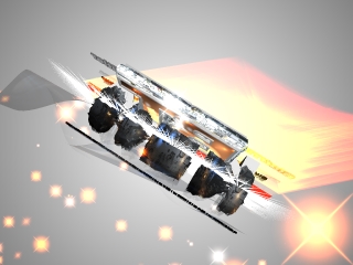
I'm confused about all the text layers with just the letter 'E'. Why are they not showing the letter E and instead a little graphic? The text shows up as Arial Black.

MrGruntHunter, 7 years ago
It's because he used Wireframe property (3rd listbox on left) on text layers, that give the truss aspect then playing with spacing parameter you can reduce space between letters. To understand you must isolate one layer and delete all others to study and understand more easily. Text is a powerful layer and liuyongcai handle that vey well.

vincent, 7 years ago


thanks liuyongcai, 8)
gato@mo, 7 years ago
Comment to this article
More by liuyongcai


About liuyongcai
288 articles 739,792 views
Contact liuyongcai by using the comment form on this page or at 139019068@qq.com