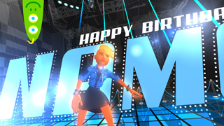
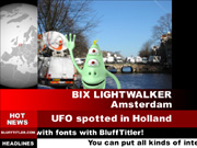
 michiel | 11 years ago | 4 comments | 13 likes | 2.8K views
Sascha Theel, BillyJack, Jesus and 10 others like this!
Below you can find a draft for the -best practices for creating templates- page for the new website.
If you have additions, corrections or questions please comment to this article.
Idea is to help each other to improve the quality of our templates. Thank you!
TELL A STORY
Every story needs a beginning, a middle and an end.
For a title, this could be: the text flies in, holds for a second and flies out. Make sure your intro does not start and end at a random point.
Many variations are possible, be creative with all the effects BluffTitler has to offer.
MOODS
Remember that stories have moods. For example happy, sad, excited, serious or fun.
In titling, you set the mood by adjusting the speed of your elements, choosing appropriate colours, lighting, fonts and graphic elements.
KEEP IT SHORT
Always remember that a title is only a title.
A good rule of thumb is to ask yourself if you have conveyed your message or mood. If so, stop.
3 to 10 seconds is usually sufficient.
THE MESSAGE IS KING
A template is successful if it communicates the intended message and mood.
The dynamic text and/or picture is the heart of your title. The purpose of everything else, including all your technical and artistically wizardry, is to support this message.
TEXTS MUST BE READABLE
Looking good is not good enough. Make sure your texts are clearly visible and readable. At least at one significant moment during the show. Make sure that this moment is long enough or frequent enough for the viewer to comfortably perceive the message.
You can use abstract expressionist effects in the background, but make sure the message is communicated by using clear written texts in the foreground. Never sacrifice your text messages in the service of fancy graphics and camera movements.
SEMANTICS
Instead of using meaningless or very specific texts it is better to use texts like:
YOUR NAME HERE
YOUR TITLE GOES HERE
Your subtitle goes here
Your Awesome Slogan Goes Here
WWW.YOUR-SITE-HERE.COM
This tells the template user which texts are editable and how they can be used. Also, keep in mind that when you capitalize texts, it suggests to the user that it is a good idea for him or her to do so as well. Use capitalization in a meaningful way to help the user decide what works best in the template.
Pictures can say:
YOUR LOGO
YOUR PHOTO
YOUR LOGO/PHOTO
DON'T MAKE IT TOO DYNAMIC
Editing texts can feel like work if there are too many.
For a specific project it can be necessary to have 10 dynamic texts, but for general templates it is best to limit yourself to 2 or 3 texts.
USE LONG TEXTS
Short big texts can be a good way to show off your amazing textures and effects, but most template users are looking for templates with longer texts.
Make sure your templates look good with titles between 5 and 15 characters and subtitles with 20 to 30 characters. This cannot be overstated. If your title only has 5 character spaces, your template will not be useful to most users.
SET THE MAX TEXT WIDTH
The text layer features a Bounds (boundaries) property. The bounds can be made visible by pressing F2. With the 1st slider of this property you can set the maximum width of the text. If the text is wider, it is automatically squeezed to make it fit.
This way you prevent texts from falling off the screen or penetrating other elements.
SET THE MAX TEXT HEIGHT
With the 2nd slider of the Bounds property you can set the maximum height. BluffTitler automatically adds soft returns to fill the space.
This way the template user does not have to enter hard returns.
SET THE MAX IMAGE WIDTH AND HEIGHT
The size of the picture layer does not depend on the resolution of the picture. Every picture layer is scaled to the same height. The width depends on the aspect ratio.
Just like the text layer, the picture layer features a Bounds property. With this property you can set the size of the rectangle.
This way you prevent pictures from falling off the screen or penetrating other elements.
USE THE RIGHT ALIGNMENT
You can right align a text by adding spaces at the beginning of each line. A much better way is to use the Right composition mode.
SET THE CIRCLE RADIUS
When using one of the circle text compositions (1st dropdown below the textbox), the radius depends on the Font size property, the Spacing property and the number of characters.
An easy trick to make the circle bigger is to add spaces at the end of the text. A much better way however is to use the Bounds property to set the radius. This way the radius is independent of the text.


Thanks so much for this very informative article!!
Kauzito, 10 years ago
Comment to this article
More by michiel


About michiel
Michiel den Outer is the founder and lead coder of Outerspace Software. He lives in Rotterdam, the Netherlands.
If he isn't busy improving BluffTitler, he is playing the piano or rides the Dutch dikes on his bikes.
858 articles 4.4M views
Contact michiel by using the comment form on this page or at info@outerspace-software.com