
 michiel | a month ago | 5 comments | 8 likes | 421 views
liuyongcai, snafu, sinus300 and 5 others like this!
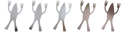
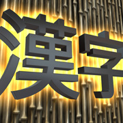
A minimalist, high contrast, tight kerning, letterform weaving effect.
It is done by:
-Adding a border to the text with the same colour as the background
-Setting the TEXT ROTATION prop to the negative of the CHARACTER ROTATION prop
-Switching to PARALLEL PROJECTION in the camera layer
The show file is included for you to play around with.
Download media files (1 KB)


Nice Michiel thnx
Filip, a month ago


Bella idea, grazie per la condivisione
nonnogio, a month ago
Comment to this article
More by michiel











About michiel
Michiel den Outer is the founder and lead coder of Outerspace Software. He lives in Rotterdam, the Netherlands.
If he isn't busy improving BluffTitler, he is playing the piano or rides the Dutch dikes on his bikes.
891 articles 4.8M views
Contact michiel by using the comment form on this page or at info@outerspace-software.com